Not a Thousand Words
The Proliferation of Meaningless Visual Stuffing
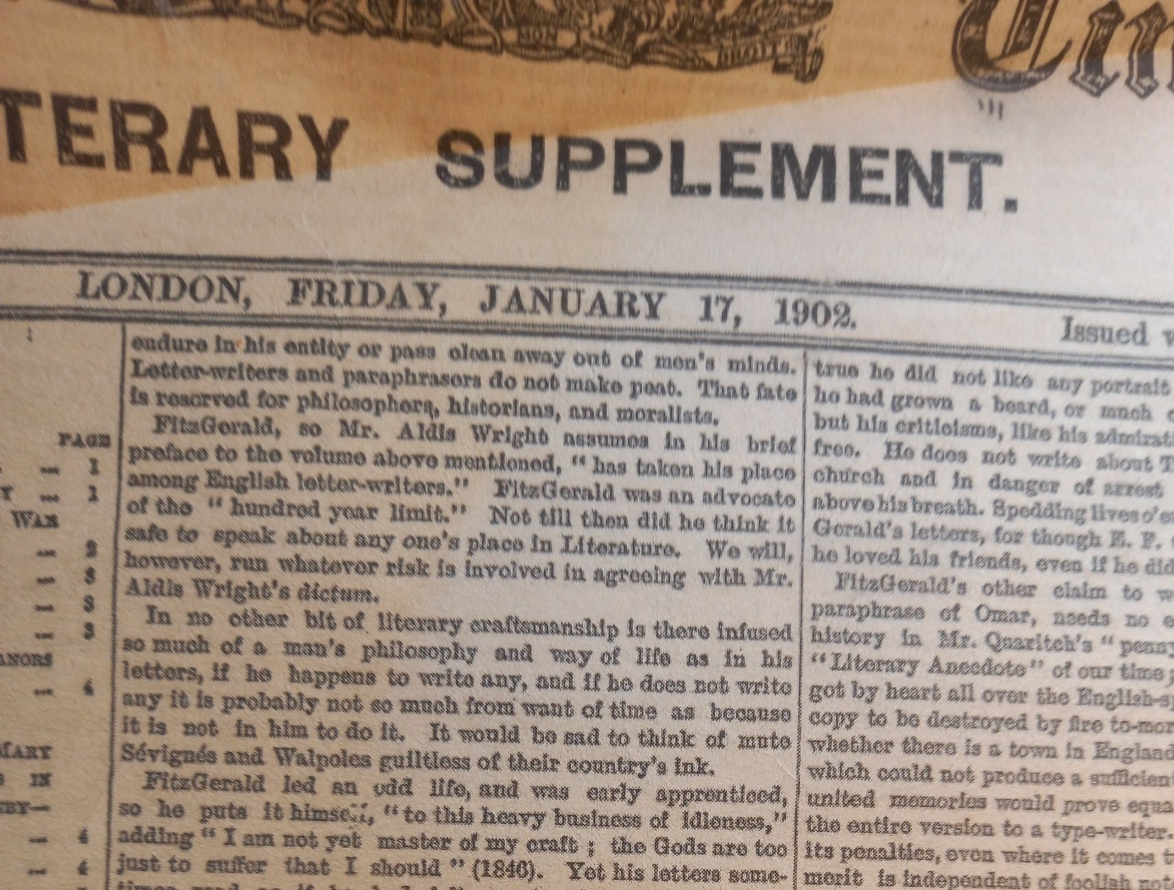
To mark its centenary, the
Times Literary Supplement gave away reproductions of the first edition - a detail of page one appears below. The first thing we notice about it, is the archaic layout with its tiny, shoe-horned and picture-less text.
Today's Times Literary Supplement uses a somewhat larger font, but only marginally so, and remains somewhat image-chary. Many of its pages (size is A3) remain text-only, and, should any image appear, it is invariably a tiny island engulfed by a massive sea of words. When I read this periodical on public transport it incites incredulous expressions, probably because the text-to-image ratio in today's magazines and newspapers lies at the opposite end of the spectrum.
The 'glossies' particularly, those magazines devoted to fashion, beauty and celebrity, consist almost entirely of photographs. When readers of the Times Literary Supplement encounter OK! or Hello! at the newsstand, some head-shaking or tut-tutting might occur. The lofty intellect disdains vacuous entertainment, but I do wonder how staff see fit to describe themselves as 'writers', when three or four sentences appear in as many pages. The 'glossies' do, however, convey by pictures what they intend to convey. That is to say, their pictures are relevant.
Relevance is key. I hold to the old-fashioned belief, that pictures should work for a living - they must convey information that words cannot; or at least convey that information more efficiently, more conveniently and more strikingly. We all know the saying about a thousand words; but this argument is not invertible. If a picture appears, it is not necessarily gainfully employed! More often than not, pictures are just meaningless visual stuffing.
Let's turn to a recent newspaper. Now, if the queen had just visited Newcastle, say, a photographer could've recorded the event. But the article is about the British constitution, and the picture of the queen is purely a stock image. The picture, therefore, presumably reminds forgetful subjects of who the queen is, and of what she looks like. A national chain of gyms has just been sold; this article is illustrated by a man lifting a dumbbell in a gym. Is this one of the said gyms? We are not told. More probably a stock image was used, in case readers have no idea of what goes on in gyms. There is a shortage of truckers; and we are shown some empty supermarket shelves. We are not told whether the bare shelves are contemporary, or this is just a stock image. But this matters not; the picture will fascinate anyone who's long been curious to know what goes on inside supermarkets, or what their shelves look like, when no groceries are sitting on them.
Meaningless visual stuffing has grown worse over the years. I've read New Scientist for over forty years - this was once a solid, serious, sober and academic periodical; my vintage copies make for sober comparisons. Right-justified text disappeared. Grammatical contractions (don't, won't, can't) proliferated. Lame jokes appeared ('Trouble is brewing for tea'). Tabloid vernacular arrived ('poo' in an article on faecal transplants; 'boobs' in an article on breastfeeding). Also, today's magazine is positively anorexic. (The same degeneracy is evident in that once-magnificent doorstop of erudition, namely Scientific American, which desperately pursues New Scientist in the dumbing-down stakes.)
Images are where the race to the bottom is most obvious. The text-to-image ratio has fallen inexorably; but in a science periodical particularly, relevance is key. For an article about a certain species of animal or plant, then it is right and proper to illustrate it thus. For an article about one of Jupiter's moons, then a suitable image is readily enough obtained from NASA. New Scientist used to be like that. But today, an article on the internet is illustrated by a man in an office, sitting in front of a computer. The article, then, is directed at readers who have never seen a computer, or a man sitting at one. An article on tea production in Assam, is illustrated by some women picking said crop. Is this a scene from Assam? No. A stock image is provided; otherwise we might think that tea is manufactured from plastic. An article on childhood ADHD is illustrated by a photograph of children. Do the depicted children have ADHD? As it happens, no faces are shown: it is a stock image, carefully cropped to avoid imputing any identifiable child. I have some idea what children look like; if only because I was not made in a factory. A further type of image, at one time wholly unknown but now all-too-frequent, is artwork: entire pages are given over to artists' imaginings. An article on dark matter is illustrated by a large, shiny, black ball, suspended above three people in a grassy field. (Dark matter is difficult to delineate, as no-one has seen it.)
Online BBC News is dedicated to meaningless visual stuffing. Articles on mental health, for example, are invariably illustrated by a seated person, leaning forward slightly, hands held over their face, elbows on their knees, in that archetypal woebegotten posture. This person is not genuinely suffering from 'mental health issues', but rather a posed model. An article on female genital mutilation in little girls, to jog our memories, shows us what a little girl looks like. Choosing this picture probably caused 'mental health issues' among the BBC's wokeish staff; for a swarthy girl would cast aspersions on certain ethnicities. The solution was to deny the facts, by choosing a little white girl.
The Daily Mail online is prime purveyor of meaningless visual stuffing. There are for example the 'crotch shots', which restrict themselves to the model's pelvic region. For an article on cervical cancer, a woman holds her hands shyly over her womanhood, even though she's fully clothed; and for an article on prostate cancer, a man holds his hands shyly over his manhood, even though he's also fully clothed. The same pictures reappear in articles about vaginal thrush or erectile dysfunction, or any other condition in this region, and are presumably necessary for readers who've led sheltered lives.
Roadside advertisements suffer from the same visual-stuffing malady. Now if a motor manufacturer wishes to sell us their latest model, it is only right that we should know what the car looks like. But numerous products and services are not so readily delineated; the solution to which, is to show us a human face. Advertisements for pensions and insurance, for example, are seldom without their faces, usually smiling or self-satisfied ones. These people have not purchased the product, by the way; for they are models. Seemingly, therefore, only good-looking people buy pensions and insurance.
The TV newsreader's face is also irrelevant: we learn very little that is not obtainable without a face, namely by the radio. Interspersed with the newsreader's irrelevant face, is plenty of meaningless visual stuffing. A link has been found between cigarette smoking and breast cancer - we are therefore shown footage of women smoking cigarettes. I believe I have a fairly good idea of what women look like, what cigarettes look like, and what women smoking cigarettes look like. We are told of new concerns about alcohol consumption, while being shown footage of customers sitting in a pub, raising glasses to their mouths, and drinking. School teachers are to go on strike - we are shown footage of a teacher standing in front of a class, with pupils raising their hands. Also, should our sluggish brains fail to comprehend, we are shown a school from outside, with children filing into or out of it. This footage is probably not contemporary; it was 'kept on file', just in case. It is necessary, in case viewers are clueless about schools, or have no idea what classrooms look like. The Archbishop of Canterbury is in the news; and the reporter rushes to Lambeth Palace, but he does not interview the Archbishop, nor does he even enter the palace. Rather, he talks to camera while standing outside in the street. Why did he not stay in the studio? Would a radio reporter behave this way? Meaningless visual stuffing. You get the picture.
Crowds provide meaningless visual stuffing in superabundance; but they are still less relevant. We are warned, for example, of an impending flu epidemic. The reporter is therefore shown in a public thoroughfare, on a busy sidewalk usually, talking to a distant camera that is gradually zooming in. Are the people filing past the reporter the ones who will catch the flu? We have no idea. Humans catch flu; we are therefore shown footage of humans. For news about obesity or mental health, on the other hand, crowds cannot be carelessly shown, in case individuals are identifiable, and aspersions thereby cast. The solution is to show legs and feet only.
In TV documentaries too, the visuals are frequently redundant. (Art is one of the rare exceptions.) Meaningless visual stuffing is provided by the so-called 'tracking shot', in which the camera moves relative to the speaker. In a science documentary, for example, the scientist is taken by helicopter to a hilltop, and left there as he talks to us, while the helicopter circles around, catching the scenery in the background. The scientist is telling us about the Second Law of Thermodynamics; something he could do just as well in front of a blackboard; but instead he is flown to a hill, and placed on its summit to do so. Similarly, documentaries on physics are regularly interrupted by computer-generated sequences of kaleidoscopic, acid-trip whirls, blurry-streaks and flashing lights.
Since most images add nothing of value, being meaningless visual stuffing, one might as well listen to podcasts.
The ironing need never be left undone.
(c) cufwulf
cufwulf@aol.com
